Project 1
Sawdust Poster
Justification
Justification
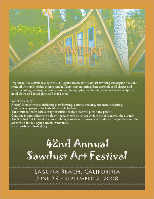
This is a great poster for the upcoming Sawdust Art Festival. It incorporates everything the client asked for in a well-designed format. It is uses four different colors that correlate with the Sawdust Art Festival’s website. The fonts are all easy to read while also helping to portray what the festival is about. The logo is shaped like the bear on the California state flag and filled with a very colorful paintbrush. I think this is perfect because the paint represents the art festival and the bear represents its location in California. The logo will also look great when transferred to t-shirts and other souvenir items at the festival. The text on the poster is broken up in an attempt to make it easier to read and more pleasant for the eyes. The important information such as dates and locations can be found quickly and easily. The paragraphs are separated into columns to help break up the bulk of the text. Overall the poster is informative and artistic, which accomplishes the main goal of all graphic designers.
Project 2
Calendar
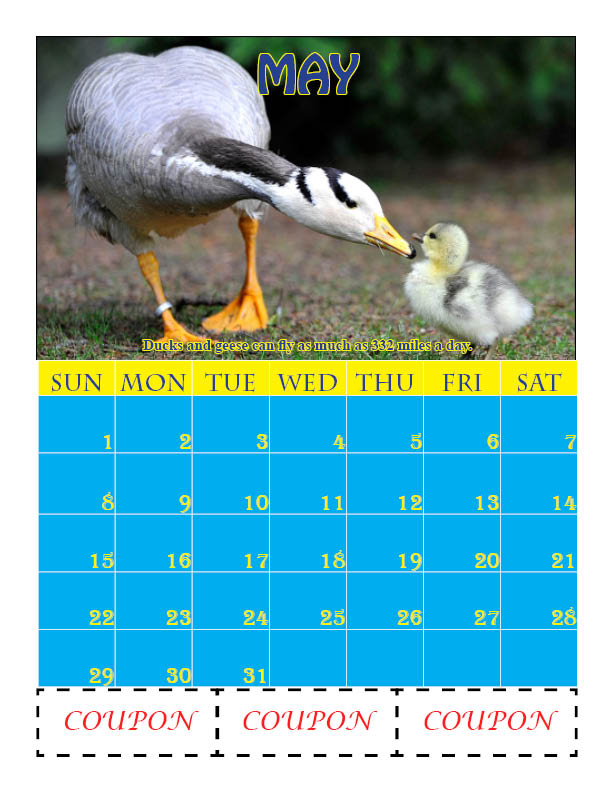
Justification
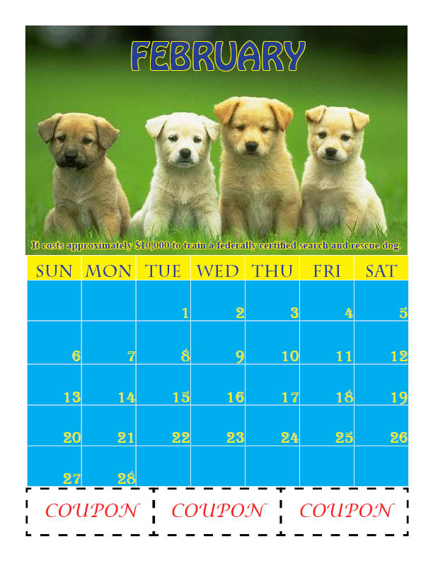
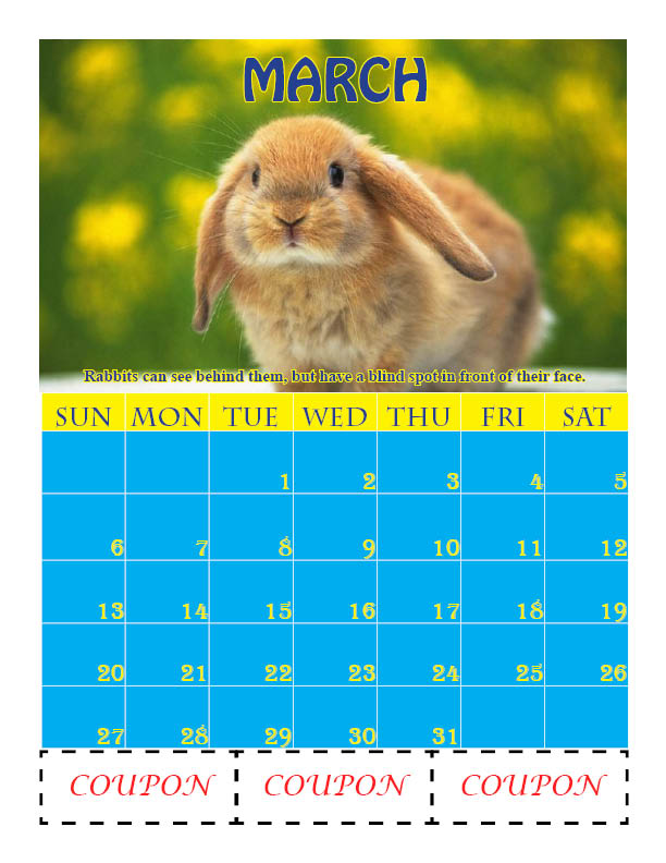
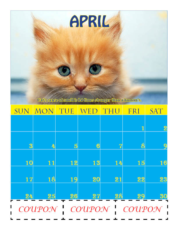
This is a great calendar to help The Humane Societys' fundraising drive. It has a simple conventional layout with one month per page. Each month is dedicated to a specific animal with a cute picture as well. This should promote the average person to donate more money towards The Humane Societys efforts. Fun facts about each animal are provided at the bottom of the picture to help educate people. The coupons are located at the very bottom of the page in an easy to cut out position. They are large enough for the sponsors to get their recognition yet not too big as to detract from the calendar. I used a three-color color scheme to help keep a since of unity throughout the calendar. The spacing in the calendar is very resourceful maximizing the available space. I used different fonts to keep the calendar interesting and pleasant on the eyes. Everything is easy to read and will help keep the owner’s life organized and on schedule.
Project 3
Restaurant Menu
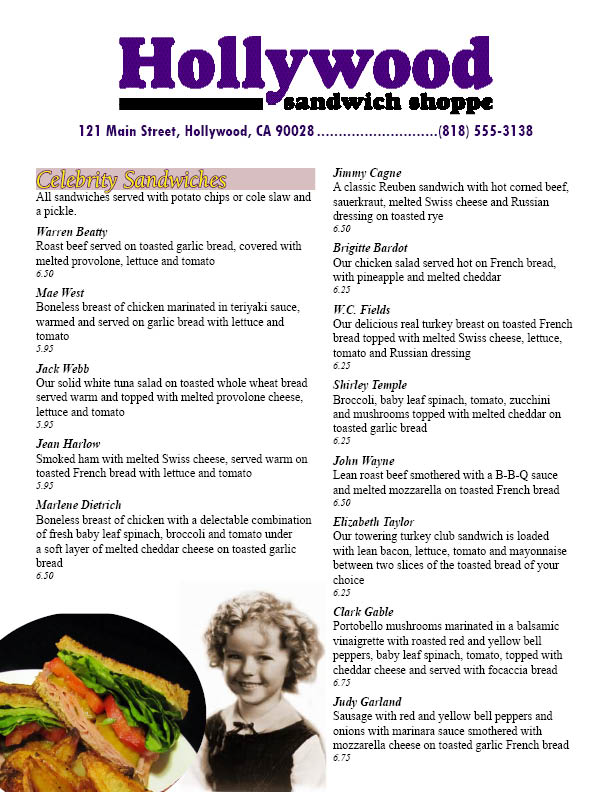
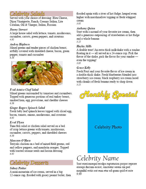
Justification
This is a very effective and cost efficient menu for the Hollywood Sandwich Shoppe. It incorporates their logo, address and phone number as well as their large sandwich, salad, and dessert selection. The photos included look good in black and white and help portray the theme of the Hollywood style restaurant. The layout is easy to read with clear category titles as well as food titles. The menu is very space efficient without everything looking to be too cluttered. The text is similar enough to create a sense of unity across the menu but different enough to make it interesting to the eye. The space created for the monthly special can be easily switched out every month with their new creations and the two column setup allows for a quick scan of the entire menu. It is very proportional and symmetric which gives it a very professional look. This menu will be a great launching point for promoting the business in the direction desired. Hollywood Sandwich Shoppe is on the path for success.
Text Citing